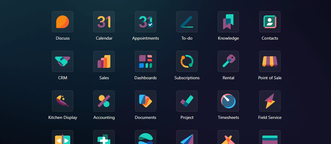
In the ever-evolving realm of ERP, Odoo has caught our attention once more with the highly anticipated Odoo 17 release. Known for its reliable features and smooth integrations, Odoo has decided to shift the spotlight onto a different stage this time – the aesthetics. In this blog post, we'll take an authentic look at Odoo 17's brand-new aesthetic website, examining the visual changes that aim to enhance user experiences and reshape digital interactions.
In a world where first impressions matter, Odoo 17 has given its interface a significant facelift. The redesign doesn't just focus on functionality; it's about creating an engaging visual experience. The modern design is immediately noticeable, promising not just a tool but an aesthetically pleasing and user-friendly platform.

What immediately grabs your attention in Odoo 17 is the Charming Iconography and Lively Color Palette. The once mundane visuals have been replaced with a spectrum of vibrant colors, adding a touch of liveliness to the user interface. The icons, with their thoughtful design, contribute to a visually delightful journey through the system.
Beyond the aesthetics, Odoo 17's interface has been revamped for User-Friendliness. The layout is intuitive, ensuring that users – whether familiar or new to the platform – can navigate effortlessly. The goal is not just about looking good but making the entire experience smoother and more efficient for users.
The new aesthetic website demonstrates Odoo's commitment to meeting not only the functional needs of businesses but also to enhancing the overall user experience. With charming icons, vibrant colors, and a user-friendly interface, Odoo 17 is poised to redefine ERP aesthetics, showcasing innovation in both form and function. Stay tuned as Odoo 17 unfolds, promising a visually appealing journey into the future of ERP.


